|
by Bob Bahr, Prairie Village Arts Council member Robert Klausing has the skills and vision to pursue an artistic idea in very different directions, thanks to his facility in acrylic painting, pastels and watercolor. These three media handle very differently, with watercolor being a somewhat unruly way of painting with water and pigment wanting to pool and run across the paper, acrylic drying quickly and opaquely, and pastel acting as a hybrid between drawing and painting.  "Buffalo River Crossing," by Robert Klausing, pastel, 26 1/2 x 32 1/2 in. Parents know that each child needs to be raised differently; teachers know that each student brings a unique set of needs for learning. Perhaps the part of Klausing's personality that allowed him to be a high-school and middle-school teacher and coach for years is the same part of his brain that allows him to smoothly work with various materials. His pastels jump out at the viewer, partly because of the energy in his strokes with these pigment sticks, and in part because of the vibrancy of pastel's colors. Klausing does move from medium to medium, but he focused mostly on pastel for years for pragmatic reasons. "One of the reasons I got into pastel was because it was immediate," he says. "I didn't have to wait for it to dry or worry about all the processes involved like with oil paints. Anyway, there wasn't the time to spend on a large acrylic or oil painting. I had seen some pastel pieces and really enjoyed them. Pastel has been around for a long time; Berthe Morisot, Mary Cassatt, and Edgar Degas, among others, proved it was a legitimate fine-art medium. I can do one fast if I don't have a lot of time to put into a painting."  "Two Mile Turnaround," by Robert Klausing, pastel, 19 x 22 1/2 in. "I enjoy the energy of linework, so pastel is very conducive to the way that I like to work," Klausing continues. "Pastel can be very linear. I like to use strokes to suggest form, sort of a tight impressionism. But you can blend pastel with a rag, your finger, et cetera if you want to create a surface that is pristine. I've always enjoyed more of a loose, expressive style. And I am always aware of the visual effects of light and its characteristics, of the effect of light in different conditions. Pastel really lends itself to expressing that light. And there is a visual energy that comes from pastel. I think people respond to that." While an artist can smudge two pastel colors together, they don't blend the same way as a liquid medium. Instead, pastelists often put different colored strokes from pastel sticks next to each other to allow the colors to blend in the viewer's eye. In oil paint, a similar approach was made by Georges Seurat in the 1880s. Seurat's method, dubbed pointillism, consisted of a painstaking application of dots of color, with all of the colors blending in the viewer's eye. Some modern printing processes utilize a similar approach.  "A Sunday on la Grande Jatte--1884," by Georges Seurat, 1884-1886, oil on canvas, 81 3/4 x 121 1/4 in. Collection of the Art Institute of Chicago.  A detail of "A Sunday on la Grande Jatte--1884" showing Seurat's pointillism approach, with pure dots of different colors sitting next to each other to blend in the viewer's eye. Note the dots of color in the man's hair, which blend into a dark brown approaching black, and all the distinct colors in the fleshtones. "If I am painting in acrylic, I can blend those colors ahead of time," Klausing says. "In pastel, I may make hatch marks with a blue, then layer hatch marks of yellow on top to create the green that I want. I have hundreds of colors of pastel so I can get most colors. But if a green is not dark enough, I can use color underneath it to get it darker. When you can't find the color you want in your pastel sticks you have to think about how to make them." Klausing works on pastel paper that's a neutral beige or light tan. His paper has a lot of tooth to grab the pastel. With care, that tooth allows several layers (Klausing says up to four) to build up before getting slick and full. He starts with hard pastels, sometimes brushing the shapes at this early stage in painting with a bit of mineral spirits to work the pigment into the paper while leaving most of the tooth unfilled, ready for more layers. Softer pastels are applied last, with the delicate pigment sitting on top of previous layers with clean, brilliant color. He sometimes uses pastel pencils at the very end for fine details.  "Fox Creek--Late Afternoon," by Robert Klausing, acrylic, 25 x 37 in. Painting with pastel sticks is a very direct way to paint--your hand is on the pigment; your hand is directly applying the paint. There is no brush handle to create distance between artist and artwork. It makes a big difference, especially in regard to control. But lately, Klausing has focused on painting with watercolor, the medium of his senior exhibition in high school. "I'm going through a watercolor phase right now," he says. "Pastel is so controlled. The spontaneity of watercolor can carry some of the energy of the painting. So I bounce back and forth between the two media." Acrylic is the middle child, with more control than the mercurial watercolor, and less control than pastel. Klausing says he puts down washes of color in acrylic in a manner similar to how one would in watercolor, then as the painting develops, his strokes become more like pastel marks, albeit with acrylic paint and brush. Watercolor, acrylic, pastel--in a sense, Klausing is trilingual. That's not for the faint of heart. Wait--we forgot to mention that Klausing also throws clay to create ceramic works of art. Perhaps that's for another day.  "Deepwater--High Water Riffle," by Robert Klausing, watercolor, 28 x 22 1/2 in.
0 Comments
 Art by Carol Kiefer Johnson By Bob Bahr, Prairie Village Arts Council member You may be familiar with the display of art in the halls of the Prairie Village municipal building, where exhibitions curated by the Prairie Village Arts Council showcase talent from the KC metropolitan area, with an emphasis on our town. But another venue, with even more attractive gallery space, presents a healthy handful of work by the same featured artists.  Art by David Coss The municipal building that houses the R. G. Endres Gallery--the locale for the bigger shows put on by the PV Arts Council--hosts hundreds of people coming to City Hall to take care of various kinds of personal, legal, and professional business, but the Clubhouse offers a more relaxed vibe. Mong says the art on view at the Clubhouse is appreciated by a wide swath of society. "We welcome thousands of visitors to the Clubhouse every year," she says. "There are four major user groups for the facility. There's the community space that's available for rental for events. There's the Natureplay Preschool. There's the 50 Plus programs that serve the senior population but also serve families. The fourth group consists of park users who come in there to use facilities, rent structures, or ask questions." Currently in the gallery space at the Meadowbrook Park Clubhouse are pieces by three area artists. Bryce Holt's straightforward, graphic approach leaves the viewer with the not-so-simple task of connecting the images with some knowledge of the scriptures. The sheer size of his acrylic paintings fills the eye with bold statements. David Coss makes three-dimensional pieces that utilize laser-cut wood to create intricate shapes of light and shadow. He speaks of blending old and new, technology and woodworking, but the balance between organic shapes and streamlined precision offers even more to ponder. Carol Kiefer Johnson brings an obvious knowledge of art history to her acrylic paintings, with passages of thin paint application contrasting with rich and colorful patterns in cloth, wallpaper, or other pictorial elements. Klimt-like women lounge with both common and uncommon pets, with a sense of abundance creating a feeling of calm and comfortable luxury.  Art by Bryce Holt A choice selection of pieces from the three artists is on view and will stay on view at the Meadowbrook Park Clubhouse until July 6.  Art by David Coss By Bob Bahr, PV Arts Council member The municipal offices for Prairie Village are in the heart of our relatively quiet and leafy neighborhood, but its residents and other artists outside our immediate environs have their eyes--and camera lenses--pointed much further afield. This is on view right now in the Art of Photography show in the R. G. Endres Gallery, at City Hall. The juror for this exhibition, which featured more than $3,000 in prize money, appreciated the wide scope of the qualifying entries. "I was surprised by the great variety of submissions, with motifs from all over the world--perhaps every continent except Antarctica," said Philipp Eirich, co-owner of Cerbera Gallery, located in Kansas City's Crossroads neighborhood. More than 45 artists contributed more than 50 photographs to the exhibition, which will be on view at the municipal offices through July 6. Their submissions were divided into three categories: People & Portraits of People, Landscapes & Architecture, and Abstract/Non-traditional/Photo-collaged/Highly digitally enhanced. Winners in each category receive a $500 prize. The R. G. Endres Best of Show award earns the winner $750. Additionally, six pieces receive Honorable Mention awards worth $200. Eirich said not only were about four entries within a point of each other at the top of his judging tally, but even the initial culling of all the entries to winnow them down small enough to exhibit was difficult and close, with only a few submissions clearly not making the grade. "It was really impressive," Eirich said. "Even the photos that did not make it into the show were of high quality. Not making it into a show does not mean it is a bad image, it's just there is limited gallery space available. It is so subjective, especially with a single judge, not a panel."  "Fourvière," by James Terry. Best of Show When he judged the photographs on display, Eirich certainly got in his steps for the day, briskly walking the halls of the municipal building, taking notes and exhibiting intense concentration. In the end, only three photos could win the top prize in each category, and only one could be named Best of Show. The Best of Show winner for the 2024 Art of Photography proved to be "Fourvière," by James Terry. "That piece was the best of both worlds, with a snapshot, street-photography aesthetic, but with a wonderful composition and the black-and-white look," Eirich said. "There's also the architectural elements but also a human being. The older gentleman is walking away, so we only see his back, which makes the effect stronger. This is not a straight road, with three bends that are emulated in the walk of the person, It has a lot of movement and the overall composition is wonderful. Oftentimes, the light can be too contrasty in a photograph, and that is the opposite of what you see in this image, with the very subtle differences in grayscale."  "Take a Second Look," by Paul McMillian. Best Landscapes & Architecture In the Landscapes & Architecture category, Paul McMillian won with "Take a Second Look." Eirich seemed to be entranced by the play of symmetry in the piece, which seems to be referenced in the title. "There seems to be symmetry in the windows, but the closer you look, the less geometric and the less symmetric it becomes, with the windows at angles," he said. "I also really appreciate that you can see the artist in the image as well." "Coupole," by Steve Johnston, won the category of Abstract/Non-traditional/Photo-collaged/Highly digitally enhanced. "This is an intriguing piece," Eirich said, "with architectural elements combined with subtle blue hues that go from almost whitish to very dark. And you become inquisitive because you don't know what it is."  "Coupole," by Steve Johnston. Best Abstract/Non-traditional/Photo-collaged/Highly digitally enhanced The winner of the People & Portraits of People category is "Tourists," by Don James. "It's just a wonderful image with a street photographer vibe," Eirich said. "The women are similarly dressed. They are clearly tourists, both wearing running shoes and both holding something on their shoulders. They don't look like sisters, but they are perhaps best friends."  "Tourists," by Don James. Best People & Portraits of People The six Honorable Mention awards went to "Ground Gears," by Brittany Buchanan; "Generational Colors in Peru," by Jessica Frieze; "Toucher le Fond," by Robin Blochlinger; "Balcony Shadows," by Paul Middleton; "Pritzker Pavilion," by Steve Anderson; and "At Alison's," by Steve Wilson. At the opening reception for the show, visitors voted on the People's Choice award, with Lauren Kinne's "Big Sur Portal" winning the honor and the $500 prize.  "Big Sur Portal" by Lauren Kinne Eirich has attended several Art of Photography shows since he moved to the Kansas City area almost 10 years ago. He looks forward to it every year and hopes to see more experimental photos next year in the Abstract category. "The question of AI hovers over the future," he adds. AI-generated or modified art is undeniably going to be on everyone's minds going forward. Photography is an artform that reflects society, so the 2025 edition of the Art of Photography should be an interesting one. Remember--it's easy to visit the exhibition. It's a mere stroll through the municipal building on Mission Road. The current show featuring the work of local 45 photographers will be on view at the R. G. Endres Gallery until July 6. by Bob Bahr, PV Arts Council member  "Cat Lover," acrylic, 40 x 30 in. It's possible to go to the finest art schools and ateliers in the world and emerge with incredible painting skills but have nothing to say. It's also possible to be a self-taught artist and paint fascinating, thought-provoking work bursting with a unique artistic vision. Exhibit A: Carol Kiefer Johnson. Johnson's work is part of a group show now view at the R. G. Endres Gallery, in the Prairie Village Municipal Offices, until May 4. Visitors there will note how Johnson combines lush textures and patterns, vibrant color, arresting figures who stare back at the viewer, and nods to art history to create paintings that don't so much tell a story but rather create a mood. That mood is often luxurious, leisurely, languid, and pretty. It all comes naturally to Johnson. "I don't really plan anything," she says. "I don't have a plan to use this pattern or that color. It just sort of happens as I go along. Checks and polka dots just make me happy, so I try to get them in. I don't give the paintings too much thought at the time. I look at it and think, I just want a flat space here or a color there, and I put it down." Her beginnings on paintings are equally spontaneous. "I start out thinking I'm going to do this painting very technically correct, but it's like your handwriting--it just sort of happens," says Johnson. "I decide that today I'm going to paint, and sometimes the dimensions or the shape of the canvas suggest something. I usually start with a face, and then that face suggests what this person is doing or thinking, and then I sort of go from there. I want people to like the paintings, but I also want them to get a kick out of them."  "Don't Look Now," acrylic, 36 x 24 in. What's next for the artist? "I would love to go bigger. The size of that peacock painting ("Bella Asiatique Journee," 48"-x-48") I love, and I'd like to go even bigger than that. But it gets harder and harder to schlep things around that are that big--I'm not getting younger."
What does Johnson want the viewer to feel, coming away from her paintings? "I'd like for them to look at the paintings and think about how they feel. What difference does it make how the artist feels? What do you, as the viewer, think about it? I find that what I feel and what the other person feels are two different things. What I feel is that life is a beautiful thing, and I want people to feel that." Johnson's work, on view at the municipal building on Mission Road, hangs alongside two other local artists--David Coss and Bryce Holt. The current show featuring these three artists will be on view at the R. G. Endres until May 5, but a choice selection of pieces from the three will stay on view at the Meadowbrook Park Clubhouse until July 6. Bob Bahr is a member of the Prairie Village Arts Council. He has written about visual art for several national magazines. He lives with his family in Prairie Village and paints a variety of subjects. He wishes there were a NYC-style bodega in the Shops.   by Bob Bahr, PV Arts Council member The trio of artists now showing at the R. G. Endres Gallery, in the Prairie Village Municipal Offices, stimulate the mind in very different ways. It's highly unlikely that a visitor could see this show, on view until May 4, and not be pulled in by at least one of the approaches presented. Bryce Holt believes that artists are storytellers, and the majority of the pieces by him on display are inspired by books in the Old Testament. His straightforward, graphic approach leaves the viewer with the not-so-simple task of connecting the images with some knowledge of the scriptures. The sheer size of his acrylic paintings fills the eye with bold statements. From left: "Mama I'm Coming Home," by Bryce Holt, acrylic, 48 x 36 in.; "Dice Game," by Bryce Holt, acrylic, 48 x 36 in. David Coss makes three-dimensional pieces that utilize laser-cut wood to create intricate shapes of light and shadow. Some of the pieces feature wood stain or acrylic paint, but all feel like Steampunk machines from an era before metal contraptions. He speaks of blending old and new, technology and woodworking, but the balance between organic shapes and streamlined precision offers even more to ponder. What will you see in his work?  "Hoot," by David Coss, wood and stain, 28 x 52 in. Carol Kiefer Johnson brings an obvious knowledge of art history to her acrylic paintings, with passages of thin paint application contrasting with rich and colorful patterns in cloth, wallpaper, or other pictorial elements. Klimt-like women lounge with both common and uncommon pets, with a sense of abundance creating a feeling of calm and comfortable luxury  "Open Window," by Carol Kiefer Johnson, acrylic, 36 x 36 in Remember--it's easy to visit the exhibition. It's a mere stroll through the municipal building on Mission Road. The current show featuring these three artists will be on view at the R. G. Endres until May 5, but a choice selection of pieces from the three artists is on view and will stay on view at the Meadowbrook Park Clubhouse until July 6. Bob Bahr is a member of the Prairie Village Arts Council. He has written about visual art for several national magazines. He lives with his family in Prairie Village and paints a variety of subjects. He wishes there were a NYC-style bodega in the Shops.  "Hexagon," by David Coss, wood and acrylic, 24 x 14 in.  From left: "Learning the Dance," by Carol Kiefer Johnson; "Stamina," by Bryce Holt  by Bob Bahr, PV Arts Council member There are no humans in Janice Schoultz Mudd's paintings now on display at R. G. Endres Gallery, in the Prairie Village Municipal Offices, but human fingerprints are all over all the paintings. Her paintings of aerial views of coastlines show land and water but also harbors, street grids, and other signs of civilization. And that concept--civilization--seems to be the lens through which much of her artistic vision is projected. When a sailing ship is shown navigating waters near modern seaside developments, old and new collide. Additionally, Mudd depicts such scenes by utilizing images from Google Earth. Schooners and satellites have little in common except that they both represent achievements of civilization.  "The Horse,"acrylic with collage, 24 x 24 in. Likewise, the image of the Uffington White Horse, a prehistoric earth sculpture in England, features prominently on another Mudd piece titled "Horse" that seems based on satellite imagery. And while "Red Light Camera" was inspired by an incident with a toll bridge in New York, the piece sits well beside her satellite imagery. The viewer might be tempted to read more into the bits of ephemera attached to the canvas in a dance of paint and collage, but sometimes a smashed bottlecap is just a smashed bottlecap. "I was crossing the Tappan Zee bridge and got caught by a red light camera," Mudd recalls. "I was thinking about something else and didn't exit to pay the toll, and all the lights went on in this big structure above me. So that painting is about the experience of it all--there's roadmap information, and that bottlecap, because you have drinks while driving, and all the trash, all the things you bring with you when you are on a road trip."  "Red Light Camera," acrylic with collage, 36 x 48 in. A trio of paintings depicting planets and moons may seem devoid of a human touch, but the imagery was inspired by photos taken by the Hubble telescope, and one of the paintings features inscribed shapes of constellations. "I was just so amazed by all the images out there in space and how beautiful they were," Mudd says. "I was enamored with the colors from the filters they were using on the photos. Also, I was thinking about how we came to be. Did we get here by accident? I do believe that we were invented by God, but I really started thinking about that. in one that have all the constellations. How did those people of ancient civilizations, from South America to Egypt, navigate? How did they see all this stuff? When they looked at the sky, how did they differentiate all those stars?" When Mudd sees the world from different or unusual perspectives, she wonders how humans engaged in their environment. An aerial view may be Mudd's way to ponder how early inhabitants of Earth survived winters and found food. "A painter is a visual person," she says. "You see these things and you think about them. I'm more fascinated in the internal workings of the mind and the way that life experiences combine with the world that we live on, and how it all comes out in the wash. There's no big message. I take it from a factual point of view. This is what happened. This is how things changed. It's more historical and the way that people think and respond and live, largely due to circumstances."  From left: "Searching for the Blue Moon," "Cadmium Night," and "Breakthrough," all three are acrylic with collage, 40 x 30 in. Part of the fun of taking in a Mudd painting is examining all the elements of her collages. As long as something is relatively two-dimensional and capable of being affixed to a canvas, it is fair game. "I have boxes of things," Mudd states. "I collect things all the time. I never know what I might want to use or what's important. People see me and they think I lost a contact. No, I'm just looking for interesting things on the ground, in a parking lot, interesting shapes or something that could be representative of something in a painting. It's somewhat indiscriminate." Or perhaps simply instinctive. Mudd doesn't seem interested in nailing down the meanings of her paintings too tightly, but to pretend that she isn't making an artistic statement would be a serious mistake. Even when the meaning of a passage in one of her paintings seems mysterious, it is succeeding, based just on that very fact. Artists make you think about the world and human experience. Mudd does that in ways both straightforward and oblique. Mudd's work is part of a group show on view in the municipal building on Mission Road until March 1.  "Fissure,"diptych, acrylic with collage, 60 x 40 inches each Bob Bahr is a member of the Prairie Village Arts Council. He has written about visual art for several national magazines. He lives with his family in Prairie Village and paints a variety of subjects. He wishes there were a NYC-style bodega in the Shops.
by Bob Bahr, PV Arts Council member It's always fun to ponder what an artist is saying with her or his art. Is that a horse from a cave painting? Is that guitar exploding into bright colors a celebration of…what? Who are these squirrels bearing gifts? It's fun, but possibly doomed. Artists often don't want to say, or don't completely know why, they chose this motif or that material. The show currently on view at the R. G. Endres Gallery, in the Prairie Village Municipal Offices, offers plenty of chances for the visitor to contemplate the vision three very different artists present. Amanda McCollum prints her digital art on 9 1/2" x 9 1/2" canvases, offering portholes into her vision of charismatic animals, handsome humans, and Art Deco flourishes. The saturated colors of vibrant flower blossoms hint at the mood or personality of models bathed in colored light in some pieces. Birds, in other pieces, suggest peace, predation, prettiness. Squirrels bear gifts of nosegays, foxes and wolves lounge in beauty. The effect is old, new, modern as a digital device and classic as a Tiffany window.
Heather L. Lowe muddies the waters separating abstract art and representational painting, turning a wolf into a flurry of colorful confetti, confronting the viewer with a white canvas with vertical slashes and smears that are quite possibly birds on a wire. An imposing trio of large canvases seems utterly abstract until one notes the suggestions of water ripples in one piece, and the unmistakable triangles of sailboats bent in the wind.
Janice Schoultz Mudd paints with acrylics, but affixes every manner of things onto the surfaces of her paintings. Sometimes these elements, ranging from a smashed bottlecap to small crescents of rubber, from wires to molds of the textures of who-knows-what, are meant to depict something; other times, they are merely the right element to enhance Mudd's compositions. Coastlines and harbors emerge, street blocks are suggested, ancient boats/dragons offer dangers in her map world. Each piece offers much food for thought.
So feed your mind. It's easy to visit the exhibition -- it's a mere stroll through the municipal building on Mission Road. The show featuring these three artists will be on view until March 1.
Bob Bahr is a member of the Prairie Village Arts Council. He has written about visual art for several national magazines. He lives with his family in Prairie Village and paints a variety of subjects. He wishes there were a NYC-style bodega in the Shops.  Clinton Lake," by Donna J. Paul. oil By Bob Bahr, PV Arts Council member Yes, the sunflowers are beautiful here in the fall, but one of the most consistently beautiful things in this part of the country, year-round, is the sky. The wispy clouds of summer don't always shield us from the sun, but they rake the sky with cottony streaks. The incredible peaches and cyans of sunsets of winter end our workdays with a soft lightshow. The flat fields serve up a warm platter for the brilliant skies above. But it's easy to stop seeing the everyday beauty. Donna J. Paul is here to help. "I want the viewer to say, 'Wow, there really is something to see in the landscape of Kansas, and the Midwest, and Lawrence in particular," says the artist, who grew up in Ohio but has lived in the Kansas City area since the mid-1970s. "It's not an in-your-face beauty, but the more you look and the closer you see, the more you find there." Paul works in both pastels and oil paints, and she pursues a kind of accessible abstraction in her work that suggests as much as it describes. Although she says she may prefer pastels over oils, her oil paintings have a marvelous way of somehow holding onto the vibrant color associated with pastels and the direct feel of pastel sticks--each mark on her oil paintings seems visible. The viewer can see her hand in the work. "Pastels are my first love," says Paul. "I have drawers and drawers filled with pastels at home. In the summer, I can work with the windows open, which is important with pastels. It's a health issue. [The dust from pastel pigments is toxic for both lungs and skin.] I work with oils in the winter. The subject matter doesn't really matter in terms of medium." Quite a few of Paul's pieces that are currently on view at the R. G. Endres Gallery, in the Prairie Village Municipal Offices, are landscapes. Paul reports that many were inspired by her morning walks with her husband around the outskirts of Lawrence. If a viewer can see individual pastel strokes with a careful look at her pastel paintings, the look of her oil paintings done without a brush is even more striking. Paul almost exclusively paints in oils using some sort of palette knife or scraper. "It started when I wanted to be bolder and looser in my art, and there's no other way to be with a palette knife," she says. "This technique suits the Kansas landscape--flat land, lots of sky, big shapes." Paul employs the typical kind of palette knife, with a triangle or blade shape and a wooden handle, but she also uses a bowl scraper and a soft, plastic, wedge-shaped tool from Catalyst. If she uses a brush at all, it's a big, inexpensive one from the hardware store. Her color palette is not extensive; Paul places a warm and a cool version of the primary colors (red, yellow, blue) on her palette before painting. She also adds an unusual color such as persimmon or Montserrat orange to shake things up. "I'm a sucker for new paint colors, and I'll try one surprise color per painting," she says. "I'll add something bright and in-your-face and sneak that in." Her current influences are pastelists, including Albert Handell and two pastelists from Scotland: Tony Allain and Norma Stephenson. "What I get from them is 'big shapes, bold colors, and extrapolating from the landscape rather than copying it,'" she says. Paul has taken workshops with the New Mexico-based Handell, and she took a drawing class art an arts center in Lawrence, but she's mainly self-taught. "I retired from being a pharmacist about 12 years ago, and I knew I needed something to keep me busy," says Paul. What's next for Paul? She has plans to do a series of night sky paintings in pastel. For these, she will work on pastel paper that is already toned either in a dark salmon or black. Don't count on these paintings showing famous landmarks. "What attracts me to a scene first, like most people, is the contrast between light and dark," says Paul. "But at the same time, I like to pick subject matter that is kind of out of the way. You may just walk past it and not think too much about it. These everyday landscapes--I want to make the mundane special." Bob Bahr is a member of the Prairie Village Arts Council. He has written about visual art for several national magazines. He lives with his family in Prairie Village and paints a variety of subjects. He wishes there was a NYC-style bodega in the Shops.
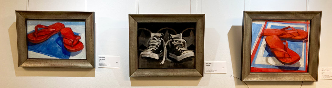
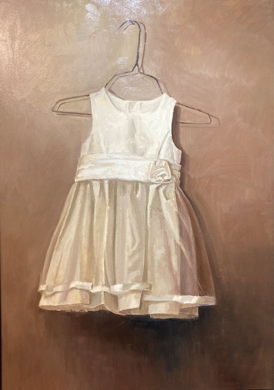
 "Baker Wetlands" by Donna J. Paul, oil  "Clear Day at the Wetlands," by Donna J. Paul, oil  by Bob Bahr, PV Arts Council member Debra Payne has seen a lot of art in her time. She taught art at Liberty High School for 30 years, teaching students how to draw and paint. So, before even counting the art she has looked at for her own enjoyment, Payne has examined thousands of thousands of paintings and drawings. She knows what it takes to execute art effectively, and she knows how art can go further to make a dramatic impression on the viewer. This explains why, when a viewer pauses in front of her painting "Flower Girl's Dress," currently on view at the R. G. Endes Gallery, in the Prairie Village Municipal Offices, the painting exerts itself beyond a superficial reading of any old dress. Exquisitely painted, it begs for a narrative. I'm afraid the viewer will have to provide that story. Payne may imbue her paintings with emotion, but there is no grand narrative at play. "A lot of my subject matter is just stuff that I think will look cool in a painting," Payne says. "Objects that are discarded--it's just things that I'm personally drawn to, maybe all the stuff in my recycling box." The key is the alchemy that artists bring to something, the transformation of an everyday object into something interesting to behold. 'I hope the viewer recognizes what I'm depicting but see it like for the first time," says Payne. "I hope that they can identify the subject but are wowed by the painting of it. I'm always pursuing the 'cool' factor." That elevation of the mundane is something she taught her students. A beautiful dress for a young girl is already a work of art…but an old, used-up flip-flop? Payne has long understood shoes to be a good subject for a painting. If one needs precedents in art history, they are there. Google Van Gogh's painting of shoes, for example. Andrew Wyeth's tempera painting of his boots treading on a weed. But most of all, Payne found shoes useful for teaching her art students. "When I was teaching high school kids, I was always looking for things to draw--things readily available and not too precious," says the artist. "Never use candy in a still life--they are always so hungry, so they will eat it--even if it is glued down! Shoes work well because we all have such a strong symbol in our brains for what a shoe looks like. Same with a flip-flop. To correctly draw a shoe--and to me, painting is just an offshoot of drawing--you have to give up on the idea of drawing the symbol. What do you really see? What shape do you actually see? I still like painting shoes today. This summer I'm going to paint shoes a lot bigger. I don't know if it will be a series, but I will return to shoes. I'm also going to paint some pieces with those magnetic letters that people put on refrigerators. I am raising chickens so I am going to paint them as well." Payne sometimes paints outdoors, and she likes it, but the weather and the sunlight changes rather quickly, making it a challenge to capture the scene. So she prefers to carefully arrange objects and set up lights in her studio to prepare her subject matter. "I spend a great deal of time setting it all up, but I find that if I have a really solid plan, it's unlikely that the painting process will falter. I like to feel pretty confident in what I'm doing for it to be a success." Before the pandemic she enjoyed participating in several artist residencies. Payne would paint in a community for one week in all four seasons, depicting the local beauty. That's preferable to some outdoor painting events, where painters compete to paint the "best" painting over a week or weekend. "Residencies were more doable," Payne says. "It was still hard work, but I had the opportunity to take as much time as I needed, to repeat a painting, or to return to the same scene a couple of times to finish a piece to my satisfaction." Payne reports that these paintings of local communities, including Lindsborg, Newton, and Marysville, appeal to collectors who appreciate a small-town vibe. Payne clearly appreciates the Prairie Village vibe. She grew up in Johnson County and graduated from Shawnee Mission West. She "married a boy from Shawnee Mission South," and earned a master's degree in art education from KU (much of it off-campus) after graduating from Emporia College. Now retired, she paints what she wants, the way she wants. "It keeps me off the streets," she says with a laugh. Bob Bahr is a member of the Prairie Village Arts Council. He has written about visual art for several national magazines. He lives with his family in Prairie Village and paints a variety of subjects. He wishes there was a NYC-style bodega in the Shops.  Shannon Meis (Brouk), pictured next to her piece "Daisy", is the 2023 State of the Arts People's Choice Award Winner by: Shannon Meis (Brouk)
The creation of “Daisy” was inspired by the flower itself and how hair is associated with feminine beauty. In making this composition, I wanted those two elements alone to be the focus, with the rest of the composition being secondary in attention. That’s why I chose to have her head turned to the side and her eyes looking down, so there’s not an obvious beautiful face rendered to symbolize beauty, but is represented through her long, wavy hair. From a materials point-of-view, the paper I chose for this piece was green, red’s complimentary color. This makes her fiery-red hair stand out even more, creating the high level of contrast I had intended in my initial sketches. In addition, I chose to keep her attire simple to ensure that her hair remained the focal point of the piece. I chose to use flat black acrylic ink and clothe her with a basic long-sleeve shirt. The rich, dark black ink adds another layer of contrast to the bright yellows, oranges, and reds in her hair. That being said, the stylistic approach to this piece was not to realistically render the entire portrait, but to capture the essence of the concept of beauty itself through high attention to detail in her hair. Notice too how the daisies cascading down her hair are all rendered flat. They aren’t bent or shaped organically in her hair; they’re purposefully two-dimensional, scattered along her curls as a complement and compositional break to her busy, long, wavy red hair. I submitted "Daisy" to the State of the Arts (along with two other portraits of mine, "Monarch" and "Glowing Orchids") in the hopes of my work being hung beside other amazing artists within the Kansas City metro area. Each year, the curated works for this show are phenomenal, and I am honored to have had one of my portraits selected to be hung beside such rich local talent! In each of my portraits, I hope that my attention to detail draws people in to take a closer look, and that they're able to draw a connection with my subject to someone in their life. There's nothing more satisfying to me than when someone views my work and says "hey, this looks like __!" Building a connection with the viewer is just as satisfying for me as the actual drawing process - both bring me so much joy! I've been doodling and drawing for as long as I can remember, and I've been fascinated with portraiture since I was 16. I can't remember a time in my life when I didn't have a sketchbook in my backpack (as a student) or in my purse (as an adult). Following my formal education and time at SCAD (my alma mater, the Savannah College of Art and Design in Savannah, Georgia), I began to hone in on the concept of beauty in my portrait work, specifically focusing on the concept of feminine beauty in Western culture. Luckily, I live in a country that is full of diversity, and I use a lot of the women I know and are inspired by to draw inspiration for each of my portraits. *Fun fact; the concept of my piece “Daisy” actually originated from my sister, a person I love and admire deeply, and who also has long, fiery red hair. The first colored pencil portrait I completed was a self portrait created 12 years ago while I was a sophomore in high school, and ever since then, I’ve never grown tired of drawing portraits and don’t intend on quitting any time soon. :) There are far too many amazing, inspiring, beautiful women in this world to grow tired of capturing them! |
AuthorWrite something about yourself. No need to be fancy, just an overview. Archives
May 2024
Categories |


 RSS Feed